Montblanc Meisterstück 146 - M nib

This is one of those pivotal moments as a fountain-pen-oholic where I just HAD to have a Montblanc fountain pen because ... well, I wanted one. To be fair, I can't afford one so I scrounged up some money to buy one used and here it is to be reviewed and enjoyed hopefully for years to come.
The box it came in is of its vintage - in the 80s. I personally think this is a great box, it's hard on the outside and has satin on the inside which unfortunately is ripping due to drying out and age. I'm not sure how I'll use this box, but I won't throw it out.

Note that little hand behind the box - that's my son trying to help me out today.

I was really unsure how to date this pen because of its features... It says W-Germany on the clip ring. Montblanc Meisterstück No 146 on the cap band. There is no serial number. So that put it roughly to 1980-1991. However, pens during that time seemed to have full windows, and single tone nibs. My nib is a dual tone... and get this, an 18K nib instead of Montblanc's 14K... As I pondered why, I looked on the warranty card: which is dated August 1989. Well, that solves the problem, this must be one of those hybrid models in between model shifts that occurred in the early 1990s. Either that or the previous owner took it in to service and it truly is a frankenstück...

Here is why I bought this pen. Something really draws me into the finial with its snow cap and its gorgeous balance of gold and black. I am really not a huge gold hardware kind of lady, and this gold colour is just pale enough that I love it. In fact, it is the same colour as my wedding band.

The body is well balanced, and while I wanted to buy the Meisterstück 149 for its massive effect, this is still not a small pen. It is full sized with perfect weighting when unposted, which is how I like it. The cap is not that heavy and if you need it to be posted, it would likely still be good weighted.
This is the classic cigar shape that many pens try to mimic... think about the Sailor 1911L... or even Platinum pens. But there's something about this particular model - the easy taper of the pstion knob with its round pen shape... it's sexy. Can't find another word for it.

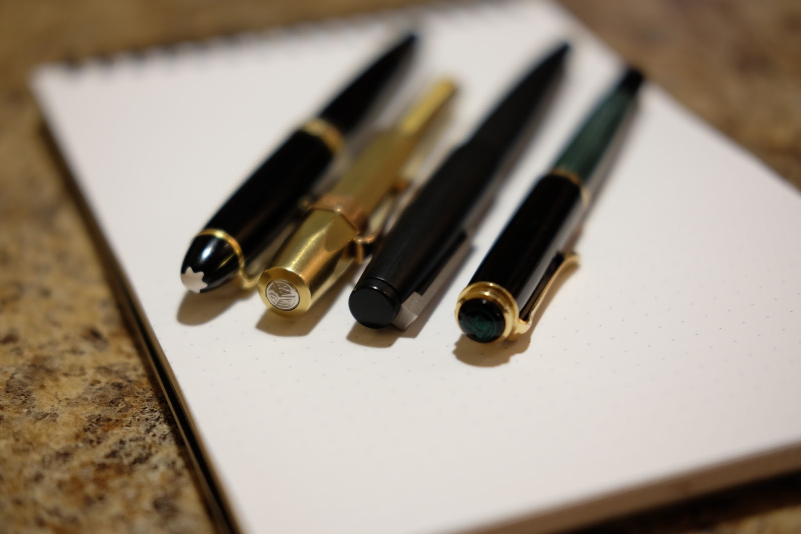
Another shot of the gorgeous cap with its triple cap band. Here is the pen unposted, and one can see that actually the pen is not too big. I'll be posting some shots in comparison to a few of my other pens (I really only have 9 to choose from, it's a small collection).


 |
| The cap |
 |
| The snow peak. |
 |
| Ink window |

My first Montblanc pen was actually not a fountain pen and a gift from my father who got it the year I was born. He gifted it to me and engraved it with my name when I finished school. I'm sad to say I hardly used it now because of the fountain pen love, but I think it has a nice place next to its big brother the 146.
 |
| My son helping out |

How big is the pen? Well it is not a lot bigger taller than the Lamy 2000, but it is girthier. Think about gripping the Lamy 2000 cap, and that is roughly just slightly larger than the section. Compared to the vintage Pelikan 400 next to it, it is much much larger both in height and in girth.
These 3 pens were designs of the time. Bauhaus 1966 Lamy 2000. 1950s Montblanc 146 styling. And 1950 Pelikan.

But really, no matter how tacky the montblanc can be or how pretentious it makes an owner... one cannot deny the simplicity and beauty of that logo.

Here he is next to my Sailor Pro Gear - note the cap band on the Sailor looks mightily similar...

Talking about vintage style... how could I forget Kaweco Sport???
Below is a writing sample, it is a wonderful nib to write and very smooth. From what I know of my seller, he did nothing but use and maybe misuse this pen and still it writes gorgeously.

I hope you have enjoyed my review! Leave me some comments if you wish, and I look forward to hearing your thoughts about the Montblanc 146. Lots of other posts coming once I am a little less busy :) This one just couldn't wait. I love it.


Comments
Post a Comment